SinceI didn’t update my portfolio for a while now, I decided to add something to it.
Dark Mode has been gaining lots of popularity lately, especially after MacOS implemented it natively and every application is trying to do the switch now.

When I thought about building my portfolio from scratch a year ago, I chose to write it in Vanilla JS and CSS so it would be super lightweight since it won’t have lots of complex UI anyway. Luckily I made use of CSS variables. CSS Variables allow you to add global variables to the root of your document. This makes it super easy to implement a simple switch like this.
CSS
So on the top of my css file I had this portion which basically sets the global variables:
:root {
  --background: #f0eddd;
  --text: #0d1a1c;
  --title: #0c4f8f;
  --separator: #cab99f;
  --grid-item: #ffffff;
  --shadow: rgba(0, 0, 0, 0.1);
  --light-blue: #64a8ca;
  --blue: #0c7de5;
}

/* Usage */
body {
  background-color: var(--background);
}
Now all I have to do is change these HEX values to a different darker palette. I don’t have to change any other CSS, just the global variables.
To be honest, this took most of my time as I didn’t how to choose colors that would make the website:
- has a dark theme
- looks like the original light version
- its colors are contrasting enough to be Accessible
I read this article from Material.io that made it much easier to decide on colors.
/* Dark mode CSS */
[dark] {
  --background: #2a2a2a;
  --text: #ebeeef;
  --title: #ffffff;
  --separator: #0c0d0e;
  --grid-item: #484b65;
  --shadow: rgba(0, 0, 0, 0.35);
  --blue: #459ff3;
  --light-blue: #9bc7f7;
}
I chose to indicate the switch using a [dark] attribute that I will add to the body tag. This selector will overwrite the root variables when enabled.
HTML
Now if I want to new CSS, I can do so by manually adding the dark attribute to the <body>:
<body dark>
...
</body>

Now we need to add a UI control that toggles this attribute. What could be better than the crescent emoji 🌒 ? It’s half dark and half light, it will always appear on whatever background. And thanks to the wide emoji support it can be added to the HTML right away. It’s perfect! I don’t need to care about the control state or change its colors based on the current rendered theme.
You can also create a more unique design that matches your website, I didn’t want to spend more than 10 minutes on this experiment 😃
<div id="theme-switcher" onclick="switchTheme()"> 🌒 </div>
I added some CSS to position it as a Material Design style floating button in the bottom right corner.
#theme-switcher {
  position: fixed;
  bottom: 0.5em;
  right: 0.5em;
  cursor: pointer;
  font-size: 30px;
}
JavaScript
If you noticed that onclick event handler in the earlier HTML block, you are correct! We are going to use this to toggle the dark attribute.
function switchTheme() {
  document.querySelector('body').toggleAttribute("dark");
}
// I would say it's a better practice to store the body element in a variable outside the function.
Voila! I have a dark theme in my website 🎉
Going the extra mile
Two more things I can add to this to make it more usable:
- Save the user preference for future visits
- Auto-switch to dark if the user device is set to dark mode (Using
prefers-color-schememedia query) (if supported)
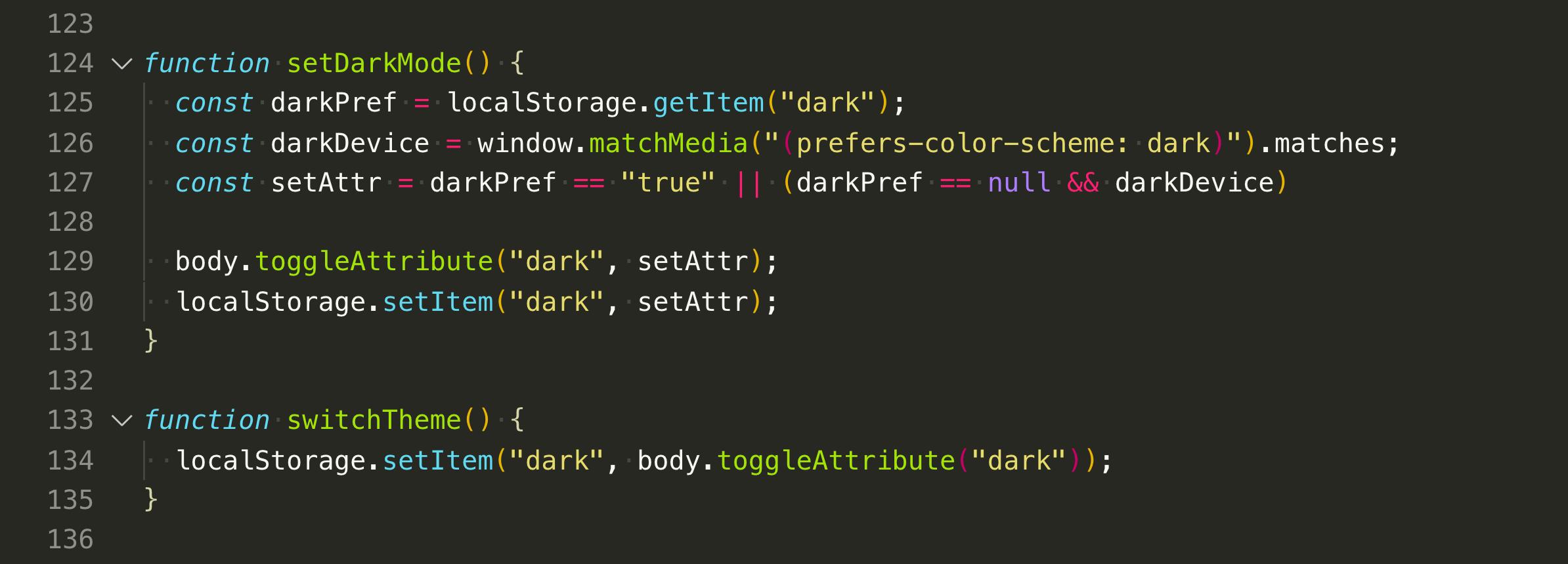
For the first one, I need to store the state of the dark attribute in the browser localStorage, and for the second one we can check for device preferences using window.matchMedia().
Then I should listen to page onload event to do these checks and apply the correct theme. The final JavaScript should look like this:
window.onload = function () {
  const darkPref = localStorage.getItem("dark");
  const darkDevice = window.matchMedia("(prefers-color-scheme: dark)").matches;

  // Favor user choice on device settings
  const setAttr = darkPref == "true" || (darkPref == null && darkDevice)

  body.toggleAttribute("dark", setAttr);
  localStorage.setItem("dark", setAttr);
}

function switchTheme() {
  localStorage.setItem("dark", body.toggleAttribute("dark"));
}
💃🏼 Magnífico! 💃🏼
